Form State Management & Validation in React JS (Part 1): A Native-only Approach


Table of contents
As a React developer, you will often find yourself grappling with the challenge of implementing effective form validation to ensure data integrity and provide a seamless user experience. While there are numerous popular third-party libraries available for form validation in React, this article takes a different approach, relying solely on the native features of React.
We will explore form validation in React exclusively leveraging native features such as useState, useEffect, and regular expressions (Regex). By using these core React functionalities, we will build efficient and maintainable form validation mechanisms that not only enhance the overall user experience but also ensure only data of the right format is sent to our backend; all without introducing unnecessary 3rd Party dependencies.
This approach will also help us gain a deeper understanding and appreciation of the challenges addressed by third-party libraries such as Formik and React Hook Form.
Setting Up
We will start with this simple login form.

We aim to not only capture the values entered by a user in the UI input fields but also validate their input, ensuring that incorrect or unsupported data is not submitted to the API.
Below is the starter code for the form we are using (excluding the CSS).
function App() {
    return (
        <form>
            <h1>Login Here</h1>

            <label htmlFor="email">Email</label>
            <input type="text" placeholder="Email" id="email" />

            <label htmlFor="password">Password</label>
            <input type="text" placeholder="Password" id="password" />

            <button>Log In</button>

        </form>
    );
}

export default App;
Managing form state using the useState hook.
We begin by first defining the states for the fields we want to capture.
// Email field states.
    const [emailAddress, setEmailAddress] = useState('');
// Password field states.
    const [password, setPassword] = useState('');
Next, we employ the onChange method of the input fields to update the values of the email and password based on the user's input:
<input
    type="text"
    placeholder="Email"
    id="email"
    onChange={(e) => setEmailAddress(e.target.value)}
/>
The password field follows a similar structure, with the only difference being the use of the setPassword setter method instead of setEmailAddress.
Now that we have successfully captured these details, let's proceed to validate them using Regex and the useEffect hook.
const EMAIL_REGEX = /^[^\s@]+@[^\s@]+\.[^\s@]+$/;
const PASSWORD_REGEX = /^(?=.*[a-z])(?=.*[A-Z])(?=.*[0-9])(?=.*[!@#$%]).{8,24}$/;
For our email validation, we want our email address to:
Not start with a whitespace or '@'.
Not have a whitespace anywhere.
Have an '@' symbol at any point following the first character.
Have one or more characters after the '@' symbol that is not another '@'.
Have any characters after the '@' followed by the dot '.' in the domain part of the email.
Have one or more characters after the dot '.' that is not an '@' until the end of the string.
For our password validation, want our password to:
Have at least one lowercase letter.
Have at least one uppercase letter.
Have at least one digit.
Have at least one special character.
Be a minimum of 8 and a maximum of 24 characters long.
We are going to test if our email and password meet this regex by running two useEffect hooks, one for each field (email and password). These hooks will run every time a user types something in the input field, triggering a change in the value inside the dependency array causing a rerender.
This ensures that our email and password fields are consistently tested against their respective Regex patterns.
useEffect(() => {
        const result = EMAIL_REGEX.test(emailAddress);
        console.log(result);
        console.log(emailAddress);
    }, [emailAddress]);

useEffect(() => {
        const result = PASSWORD_REGEX.test(password);
        console.log(result);
        console.log(password);
    }, [password]);
When our app initially mounts, the validation shows false, since our input fields are empty. With each subsequent keystroke, the validation test is triggered afresh against the input. In the screenshot illustration below, the validation consistently returns false as I type the email address until I meet the validation criteria for the email address. At that juncture, the validation logs true.

Inasmuch as we are successfully validating the data under the hood, the user remains unaware if they are entering the wrong data format. Given that users typically do not inspect web consoles for errors, our UI needs to promote a more intuitive user experience
To improve user feedback, our first step should be to capture the results of each test (true or false) returned when both useEffect hook calls run, rather than merely logging them to the console. Let's introduce two new states to store these values.
const [validPassword, setValidPassword] = useState(false);
const [validEmailAddress, setValidEmailAddress] = useState(false);
The initial state for both variables is set to false, updating dynamically with each keystroke to reflect the current validity status. While the validity is false, we want to provide users with informative error messages.
To achieve this, let's have a paragraph right under the email input field to be displayed when the entered email is invalid. We'll implement conditional rendering for the paragraph, displaying text based on the email's validity.
<p
className={!validEmailAddress ? 'show-message' : 'hide-message'}
>
Do not use a space anywhere in your email. <br />
Use an @ symbol to indicate your email provider eg <em>@gmail</em> or <em>@kodihomes</em> <br />
Do not use more than one @ sign in your email before or after indicatingyour email provider. <br />
Use a dot to indicate your email provider's domain e.g <em>.com</em> or <em>.co.ke</em> <br />
</p>
Let's do the same for the password field:
<p
    className={!validPassword ? 'show-message' : 'hide-message'}
    >
    8 to 24 characters <br />
    Must include upper and lowercase letters, a number, and a special character. <br />
    Allowed special characters: <span aria-label="exclamation mark">!</span>
                <span aria-label="at symbol">@</span>
                <span aria-label="hashtag">#</span>
                <span aria-label="dollar sign">$</span>
                <span aria-label="percent">%</span>
</p>
NB: aria-label attributes are an accessibility feature that enables screen readers to read the description of each element.
Let us quickly define the two CSS classes responsible for showing or hiding the error message, depending on the password's validity.
.show-message {
    font-size: 0.75rem;
    border-radius: 0.5rem;
    border: 1px dashed #fff;
    color: #fff;
    padding: 0.55rem 1rem;
    position: relative;
    bottom: -10px;
}

.hide-message {
    position: absolute;
    left: -9999px;
}
Currently, our page displays as follows when it loads:
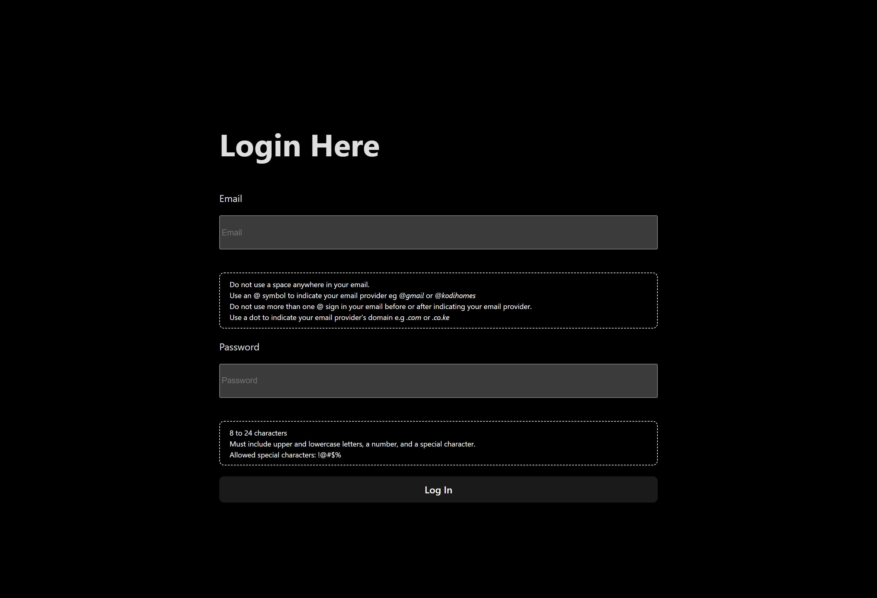
From our initial setup, this is a positive stride in clearly informing users about the expected input data.
When our user adheres to the validations, the error messages disappear, which is what we want.

However, we encounter a couple of User Experience issues with our form. One is that displaying the validation message for each field simultaneously is not ideal. Consider a scenario with 10 input fields, each showing a message — the form would likely extend across multiple pages, resulting in a visually cluttered appearance.
To address this, we introduce yet another state to monitor the focus state of each input field.
const [emailAddressFocus, setEmailAddressFocus] = useState(false);
const [passwordFocus, setPasswordFocus] = useState(false);
In each input field, we add the onFocus and onBlur attributes which evaluate whether a user has clicked inside or outside the input field.
In our case, when they click on the email address field (onFocus), we want to set its focus state to true; conversely, when they click outside of it (onBlur), we want to set its focus state to false. The same principle applies to the password field.
<input
    type="text"
    placeholder="Email"
    id="email"
    onChange={(e) => setEmailAddress(e.target.value)}
    onFocus={() => setEmailAddressFocus(true)}
    onBlur={() => setEmailAddressFocus(false)}
/>
Next, in the conditional paragraph previously displayed when the email was invalid, we incorporate an additional condition. Now, the paragraph will only be visible when the relevant field is in focus.
<p
    className={ emailAddressFocus && !validEmailAddress ? 'show-message' : 'hide-message' }
    >
        {/*rest of the code*/}
</p>

Still, we have yet to implement a mechanism to prevent a user from submitting invalid data to the API. To address this, we can prevent the form's submission as long as any data does not meet our validation criteria.
This can be achieved by adding the disabled attribute to the submit button.
<button
    disabled={!validEmailAddress || !validPassword ? true : false}
    >
            Log In
</button>
When it evaluates to true, this attribute will disable the button as long as either the email or password is invalid.

Conclusion
In conclusion, our exploration of native form validation in React using built-in features like useState, useEffect, and regular expressions has revealed both its advantages and drawbacks. The native approach allows developers to have fine-grained control over the validation process, enhancing their understanding of how validation mechanisms operate under the hood.
Pros:
Control and Customization: Native React features provide developers with granular control over the validation logic, enabling customization to suit specific project requirements.
Dependency Management: By exclusively relying on native React functionalities, the codebase remains lightweight without introducing external dependencies.
Learning Experience: Native form validation serves as a valuable learning experience for developers, fostering a deeper understanding of React's core concepts.
Debugging Ease: Debugging is facilitated by direct access to the logic, aided by the effective use of React DevTools.
Cons:
Boilerplate Code: Implementing form validation natively can result in verbose code, potentially leading to increased development time and complexity.
Limited Abstraction: The absence of higher-level abstractions might make the code less concise and reusable compared to solutions provided by third-party libraries.
Time-Consuming: Creating a comprehensive validation system from scratch could be time-consuming, especially for complex forms, when compared to leveraging existing solutions.
Scalability Challenges: For larger projects with numerous forms, maintaining and scaling native validation logic might become challenging, potentially leading to increased complexity.
Learning Curve: Developers new to React might find it challenging to implement robust validation logic without the guidance of higher-level abstractions provided by third-party libraries.
While this native approach offers transparency and control, it's essential to acknowledge the trade-offs involved in terms of code verbosity and development efficiency. In the next article, we will explore React Hook Form, a third-party library that addresses some of these challenges by providing a more streamlined and efficient solution for form validation.
See you then as we explore how React Hook Form simplifies the process, offering a balance between control and abstraction for an enhanced development experience.
Happy Coding! 😊