Mastering CSS Grid: A step-by-step Guide

Introduction
Achieving flexible and visually compelling responsive layouts is a defining skill in web development. CSS Grid is an alternative layout system that stands as a more powerful counterpart to Flexbox.
Offering unmatched control and adaptability, CSS Grid empowers developers and designers to effortlessly craft intricate, grid-based layouts with finesse.
This comprehensive guide serves as your passport to the realm of CSS Grid, presenting fundamental concepts and advanced techniques as a compelling alternative to Flexbox. Whether you're a seasoned developer seeking a new perspective or a newcomer exploring layout possibilities, this article acts as your guide to mastering the art of CSS Grid layout.
Embark on this walkthrough as I guide you through the core principles of CSS Grid and the robust grid structure behind it. Discover the art of seamless positioning and sizing of elements, creating responsive designs, and conquering layout challenges. You will also delve into the nuances of layering and stacking contexts, experiencing the transformative impact CSS Grid brings to dynamic and visually stunning interfaces.
Diving In: Our Starting Point
Consider the following HTML code:
<div class="container">
    <div class="boxes box1">
        <h2>Box 1</h2>
    </div>
    <div class="boxes box2">
        <h2>Box 2</h2>
    </div>
    <div class="boxes box3">
        <h2>Box 3</h2>
    </div>
    <div class="boxes box4">
        <h2>Box 4</h2>
    </div>
    <div class="boxes box5">
        <h2>Box 5</h2>
    </div>
    <div class="boxes box6">
        <h2>Box 6</h2>
    </div>
    <div class="boxes box7">
        <h2>Box 7</h2>
    </div>
    <div class="boxes box8">
        <h2>Box 8</h2>
    </div>
    <div class="boxes box9">
        <h2>Box 9</h2>
    </div>
    <div class="boxes box10">
        <h2>Box 10</h2>
    </div>
</div>
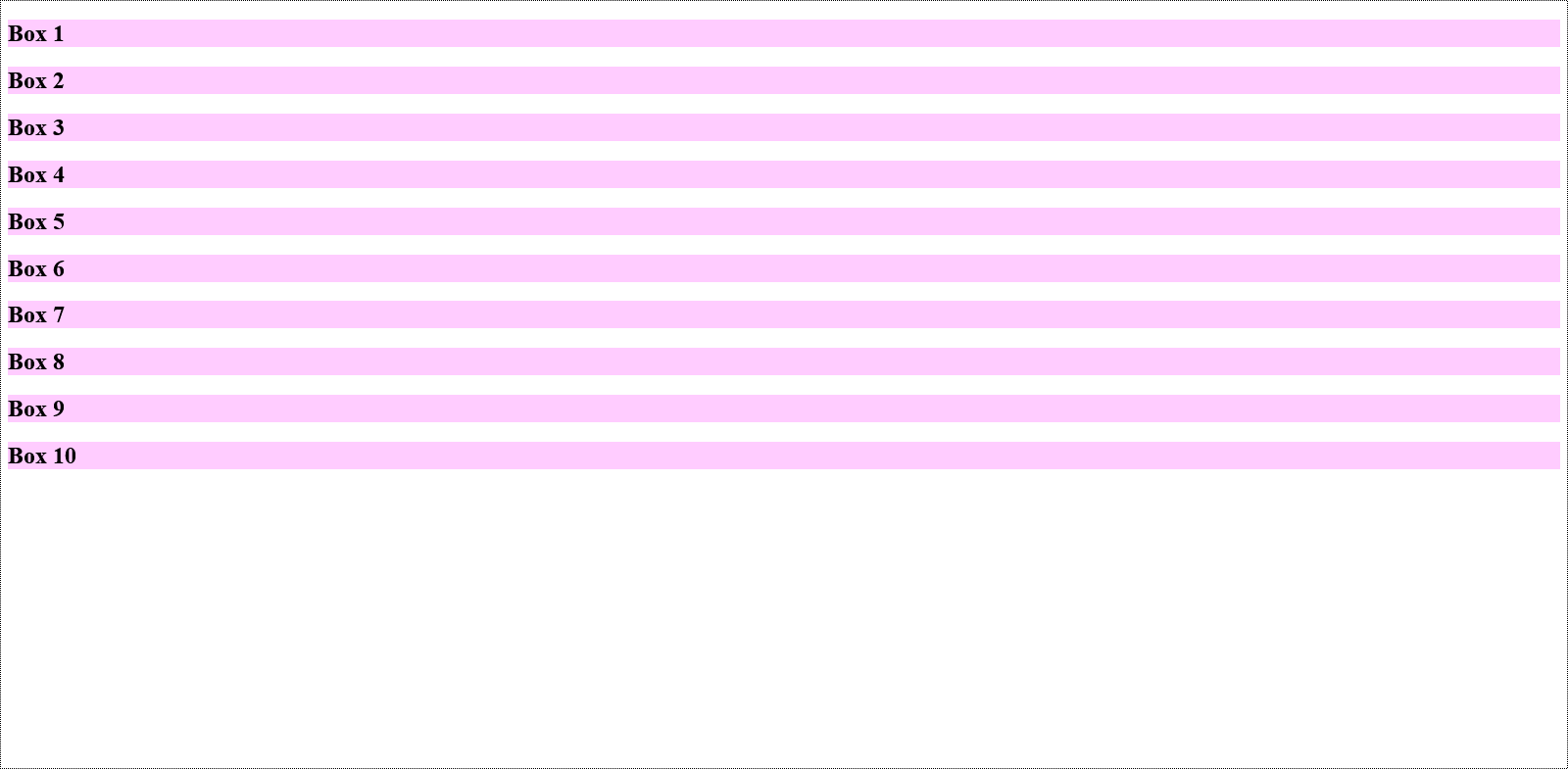
All the div elements are enclosed within a parent div that bears the container class. Each div is labelled with its corresponding number, ranging from "Box 1" to "Box 10." Additionally, each has a dual class assignment, comprising a common boxes class and an exclusive box class similarly marked with its corresponding number.
Let's first give a background to the boxes class to make the individual boxes visible:
.boxes {
    background: #ff42ff44;
}
This is how the page will now appear:
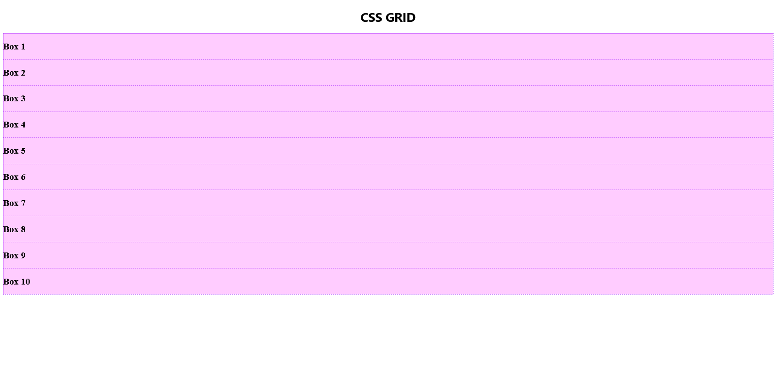
display: grid
We now set the display property of the container to grid. At first glance, the most noticeable alteration is the disappearance of margins between the boxes, with no other significant changes.
That's because when creating a grid, we need to define the desired number of rows and columns.
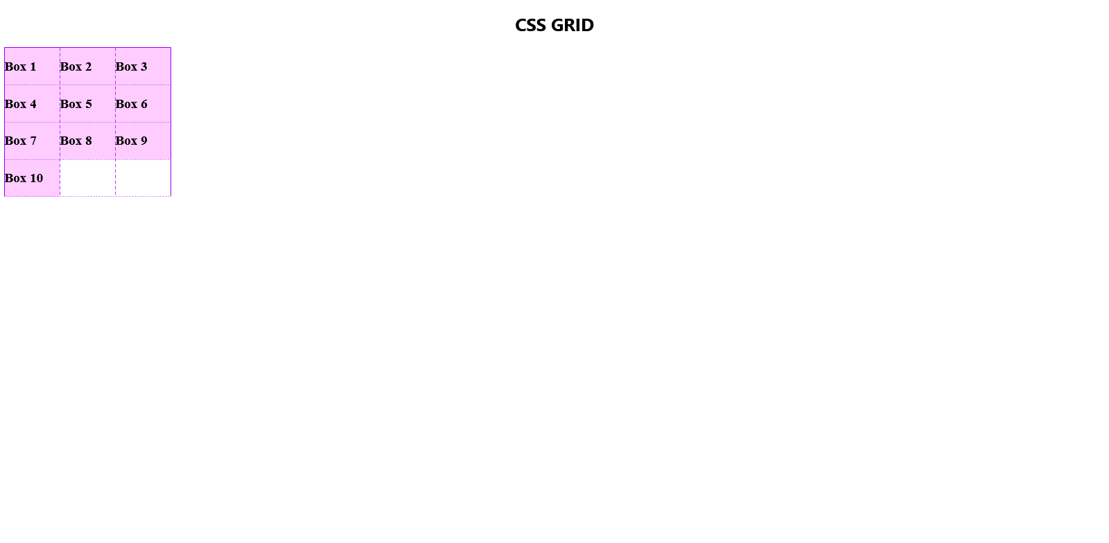
In the following code snippet, a single column is generated with a width set to 100px.
.container {
    display: grid;
    grid-template-columns: 100px;
}
The one below creates a grid layout with three columns, each having a width of 100px.
Notice how in both examples, the instances of 100px within the grid-template-columns property signifies the number of columns. In this case, three instances of "100px" indicate the allocation of 100 pixels to each column.
.container {
    display: grid;
    grid-template-columns: 100px 100px 100px;
}
If you open the browser inspector and hover over the container element, you will see the outline of the grids as shown below.
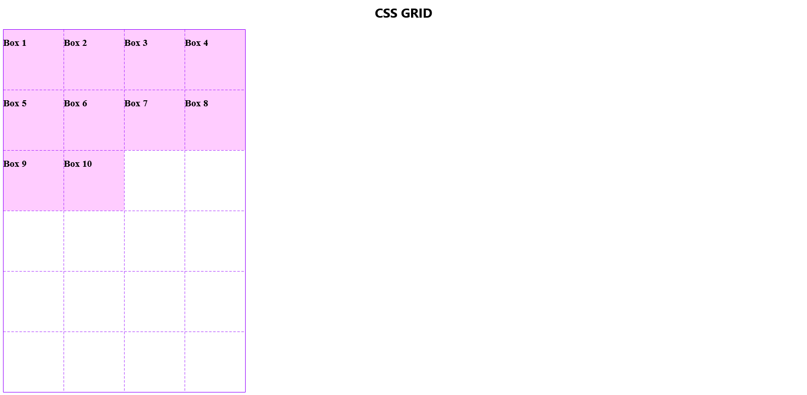
The same principle applies to rows. The frequency with which you repeat a measurement unit in the values of the grid-template-row property determines the number of new rows the grid will generate.
From here, we want to create a grid with 6 rows of 150px height and 4 columns of 150px width.
.container {
    display: grid;
    grid-template-columns: 150px 150px 150px 150px;
    grid-template-rows: 150px 150px 150px 150px 150px 150px;
}
When we fire up the browser inspector we see the outline of the four columns and 6 rows created by the grid as below.
A more effective way to express this will be discussed shortly.
The Boxes
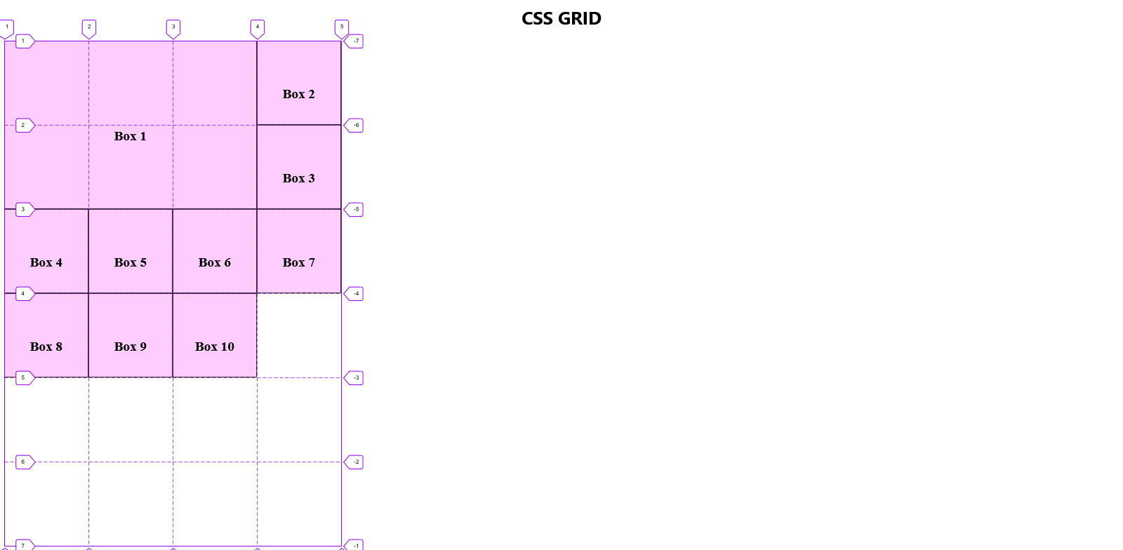
By default, as illustrated above, each box occupies a single cell in the grid, leaving the remaining cells empty. To customize the size of individual boxes, we can specify their starting and ending positions in both the columns and rows.
Sizing individual boxes
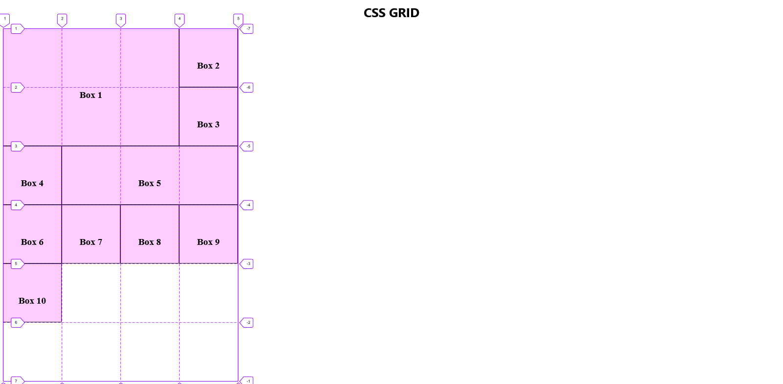
Say we want Box 1 to extend and occupy the entire area currently occupied by Boxes 2, 3, 5, 6 and 7 so that it looks like this:
We can attain this layout by using the following code snippet:
.box1 {
    grid-row-start: 1;
    grid-row-end: 3;
    grid-column-start: 1;
    grid-column-end: 4;
}
Here, we begin by defining the starting and ending row numbers for Box 1. When referring to the start of the first grid row, it implies the initial horizontal grid line that we intend the box to touch (as labelled in the grid).
Given that the value is set to 1, it shows we want it to touch the uppermost line of the grid. This uppermost line is consistently identified as Line 1, representing the outermost boundary.
Subsequently, we specify that the bottom of Box 1 should connect with the third horizontal line of the grid from the top.
In the context of the grid's columns, a parallel logic is employed, with the distinction that we now consider lines running vertically.
Box 1 should subsequently align with the first vertically-running line, denoted as Line 1. Similarly, the last vertically-running line it should be in contact with is Line 4.
Note: As depicted in the illustration above, the resizing of Box 1 results in the displacement of the other boxes to occupy the remaining cells in the grid. This displacement occurs because explicit positioning for the remaining boxes has not been provided.
grid-row, grid-column
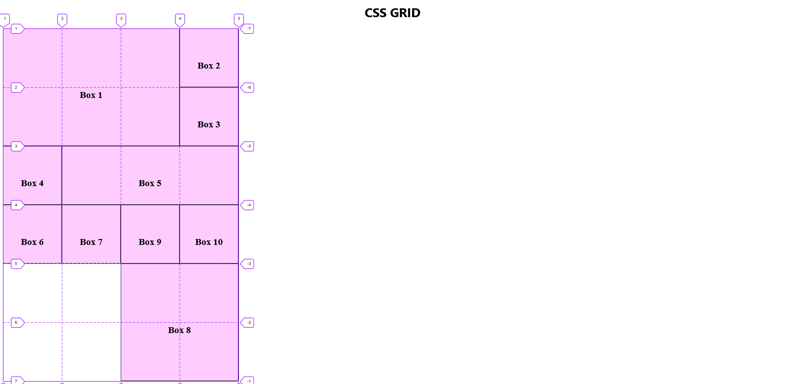
A shortcut exists for the above code, and we'll employ it to position Box 5.
Our new objective for Box 5 is not only to occupy its current cell but also to extend into the cells currently occupied by Box 6 and Box 7.
Compare this image with the one in the preceding illustration to observe how Box 5 has been resized and repositioned within the grid.
We accomplished this using the shorthand version of the earlier code:
.box5 {
    grid-row: 3 / 4;
    grid-column: 2 / 5;
}
In this notation, the numbers to the left of the forward slash denote the starting position, while those on the right represent the ending position.
As clarified, we have specified that the topmost part of Box 5 should align with the third horizontally running line in our grid, Line 3. Similarly, the last horizontal line in contact with Box 5 is set to Line 4.
The same logic applies to columns.
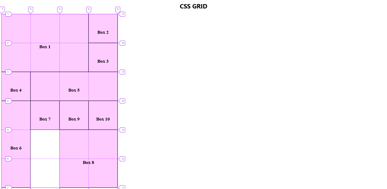
grid-area
Still, there is an even shorter way to position an item in a grid.
Let us use this notation to size and position Box 8.
We want the box to leave its current spot and occupy the empty 2x2 square at the bottom of the grid. (check the next illustration for the gridlines)
The result should look like this:
This can be accomplished using the following syntax:
.box8 {
    grid-area: 5 / 3 / 7 / 5;
}
The four numerical values provided for grid-area signify, in sequence:
grid-row-start
grid-column-start
grid-row-end
grid-column-end
NOTE: Always separate the values in shorthand methods with a FORWARD SLASH.
When visualizing Box 8 overlaying the grid, it becomes evident that it occupies the final four cells precisely as intended.
The span keyword
grid-row: span_ , grid-column: span_
Additionally, we can instruct a box to span across a specific number of cells from its present location.
We regard the box's current position as the starting point when employing this method. If we direct it to span over 3 cells, we are essentially instructing it to cover two additional steps since we consider its current position as the initial step.
Let's direct Box 6 to span three cells downward from its current position.
The expected outcome should be this:
Contrast this with the prior illustration to identify Box 6's previous position.
To extend it across those three boxes, we use the following syntax:
.box6 {
    grid-row: span 3;
}
NOTE: While the span property is convenient, it has a significant drawback. If an adjacent element with absolute values is repositioned, the element positioned using the span property will be displaced. This means that layering cannot be achieved with an element positioned and/or sized using the span property. We will see this in action below.
Layering in CSS Grid
Remember we previously stated that using CSS Grid we can position things however we want?
But what happens when we position something where another element had been positioned? That's where Layering happens. The newly positioned element will be stacked on top of the previously positioned element.
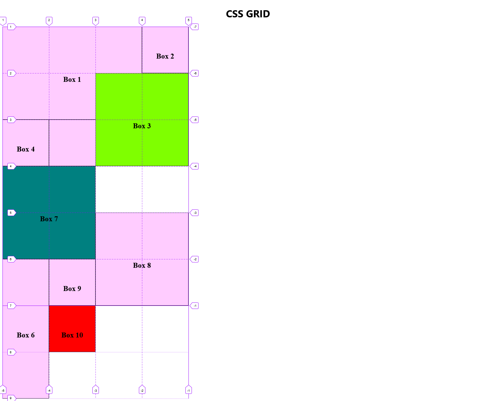
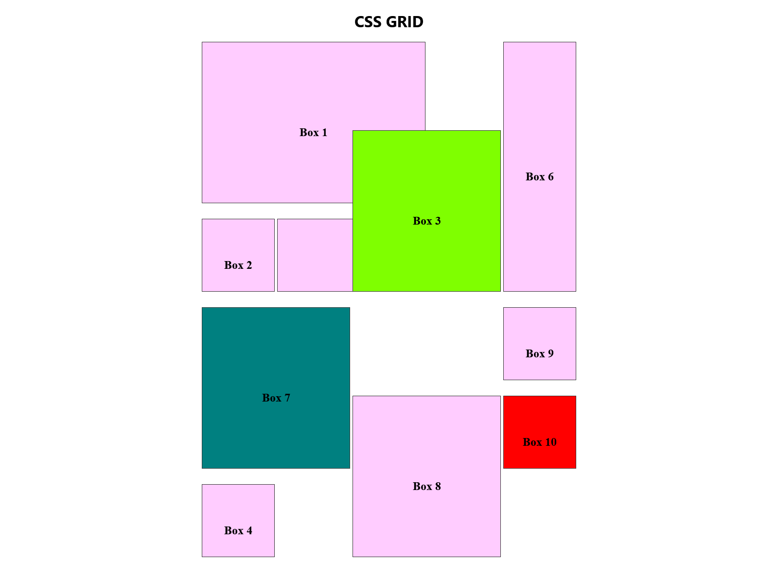
Let's examine Box 3. Note in the previous illustration where it is at this point.
We want to adjust its size and placement to fit within a 2x2 square, spanning one cell in Box 1 and two cells in Box 5. Additionally, we'll assign it a distinct colour to effectively illustrate the layering effect.
The outcome should look as follows:
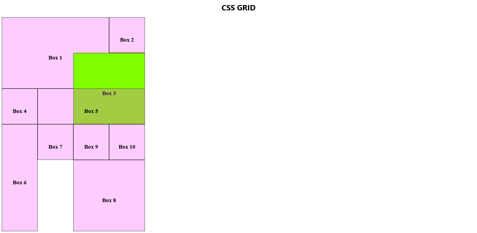
The greenish hue of Box 3 extends beyond its designated cells, overlapping into the areas occupied by Box 5 (2 cells) and Box 1 (1 cell).
Box 3's positioning, defined by the code below, led it to overlay other boxes in the assigned cells, creating a layering effect.
.box3 {
    background-color: chartreuse;
    grid-area: 2 / 3 / 4 / 5;
}
If a single colour is applied, why does it appear differently in the cells overlaying Box 1 and Box 5? This discrepancy arises because of the stacking order, with Box 3 having a higher stacking level than Box 1 but a lower level than Box 5.
Put simply, the stacking order in HTML follows a straightforward principle: the element declared first goes to the bottom of the stack, and each subsequent element is added on top, forming a higher stacking context. In our HTML example, Box 3, declared later, is stacked above Box 1, giving it a brighter shade. However, it remains below Box 5, producing a slightly more subdued appearance.
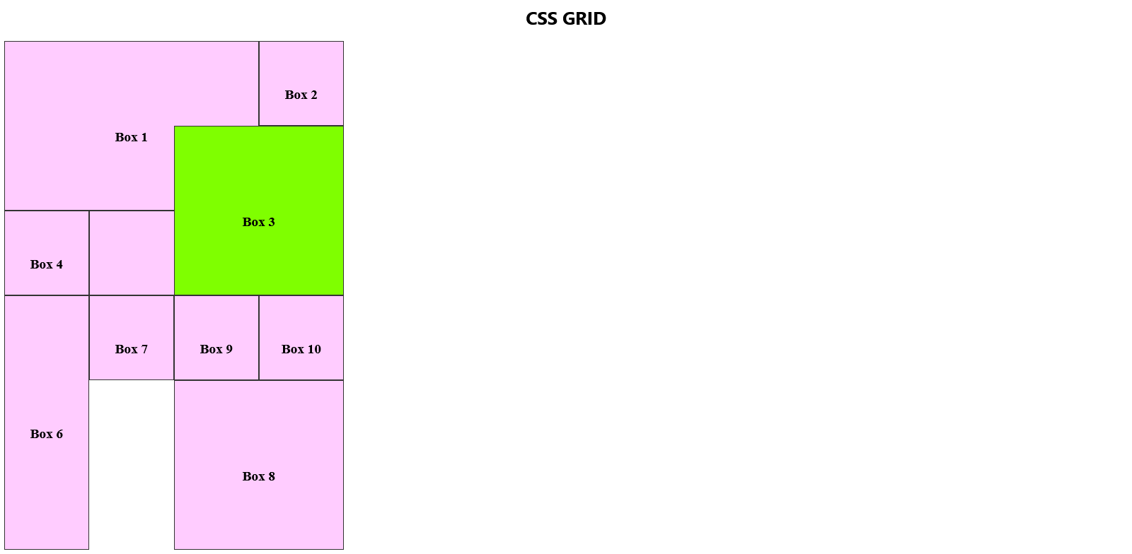
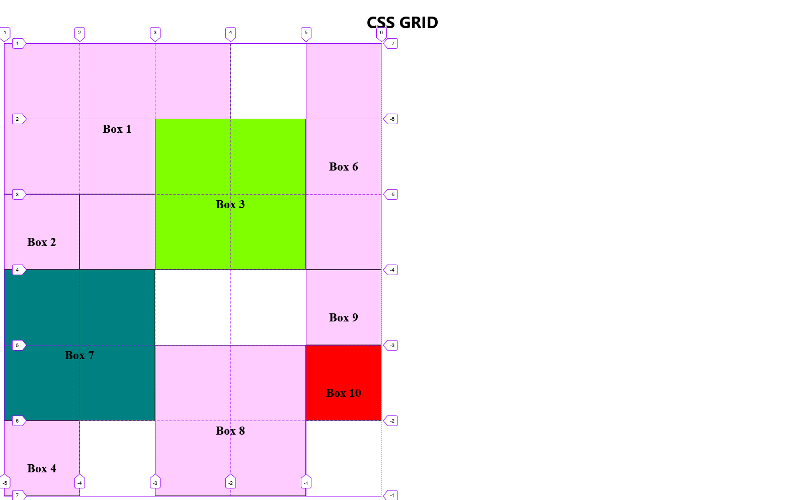
To modify this appearance, we introduce a z-index property to Box 3 and assign it a value greater than 0.
.box3 {
    background-color: chartreuse;
    grid-area: 2 / 3 / 4 / 5;
    z-index: 1;
}
The result should be this:
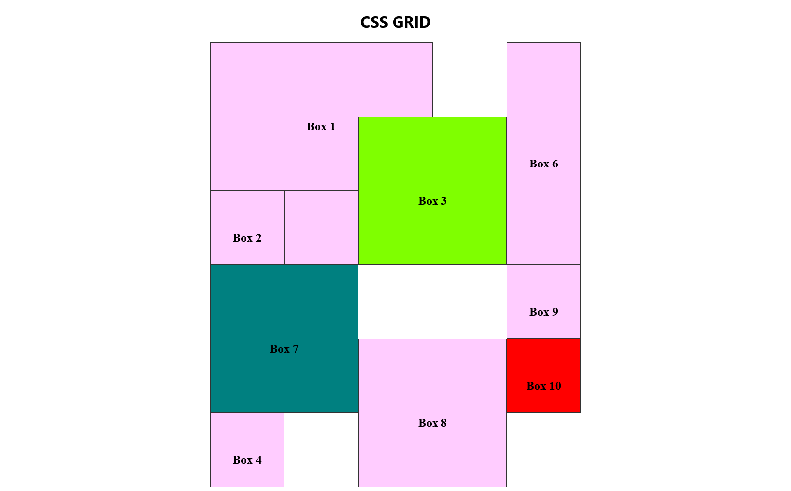
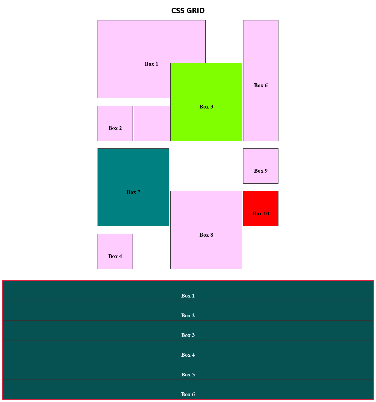
Layering over an element positioned using the span property
How about we adjust the size and position of Box 7 into a 2x2 square? That way it occupies two cells in Box 6 (positioned using span property) and also the vacant cell right below it.
We will additionally give it a teal background so we can see the layering at work.
We might expect the result to look like this:
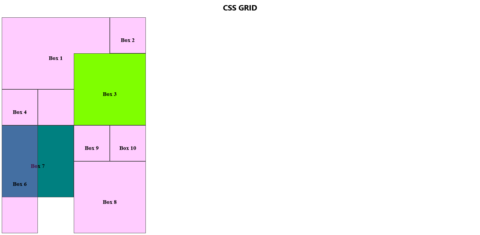
The code to have Box 7 occupy those cells is as follows:
.box7 {
    background-color: chartreuse;
    grid-area: 4 / 1 / 6 / 3;
    z-index: -1;
}
What do we get as the outcome?
Box 6 has been displaced to another cell. Why does this happen? It's because Box 6 was sized and positioned using the span property.
When a box is positioned with the span property, if a neighbouring box is positioned or repositioned using absolute values, it simply displaces the former. A box positioned with the span property cannot be layered, unlike what we observed with Box 3 on top of Box 1 and 5.
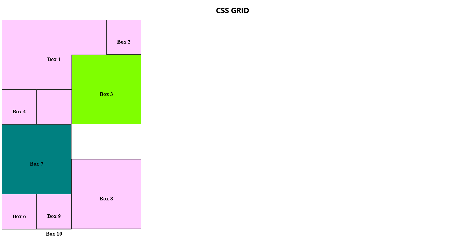
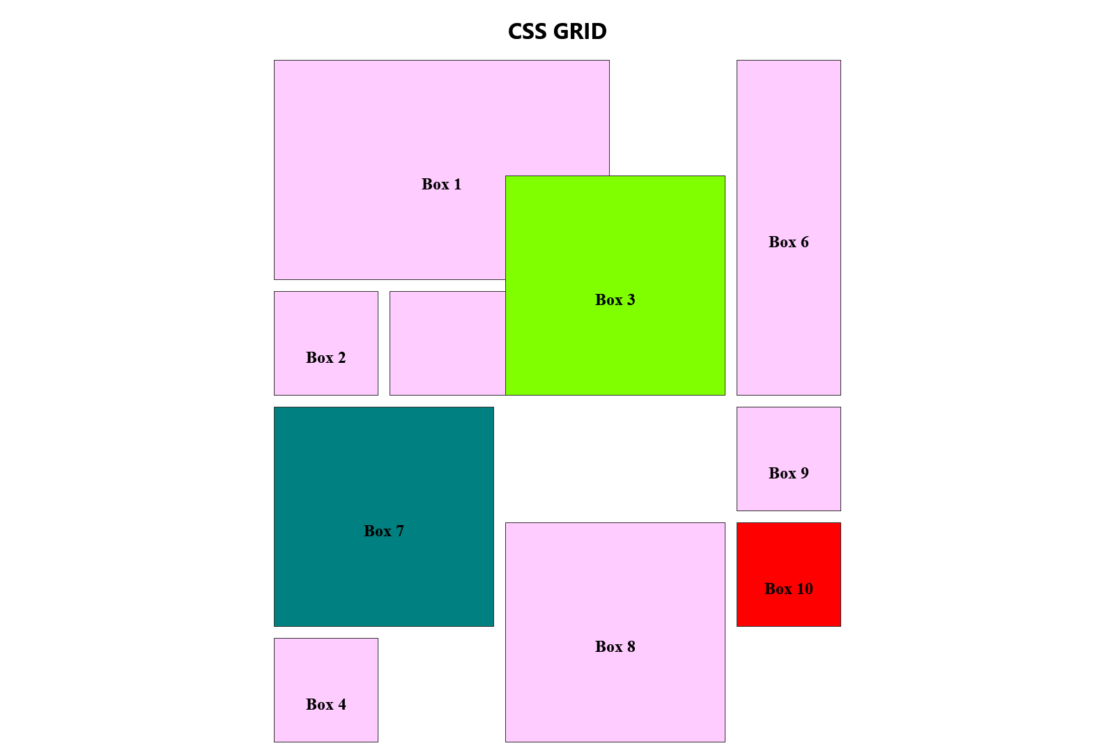
Implicit Grids
We started our grid with 24 cells: 4 columns and 6 rows.
Upon inspecting the container div in the browser inspector now, you'll observe that Box 10 now extends beyond the confines of the 24 cells and appears significantly smaller compared to the other boxes.
Once we've utilized all available cells (NOTE: not necessarily every cell, but those that can be used), Grid generates an implicit grid— a grid beyond the explicitly defined one.
An implicit grid inherently has smaller cells compared to the explicitly defined grid. This is because it does not inherit the properties set for the explicitly defined grid.
To solve this, we can introduce a grid-auto-rows property to our container, defining the size for any implicit grid generated by Grid. Considering our initial cells were 150px, we'll set the value of grid-auto-rows to 150px as well.
.container {
    display: grid;
    grid-template-columns: 150px 150px 150px 150px;
    grid-template-rows: 150px 150px 150px 150px 150px 150px;
    grid-auto-rows: 150px;
}
With this, each time Grid introduces a new row, it adheres to the same size as the rows explicitly defined.
Also, notice how adding that single property now gives our grid 32 cells.
Implicit grids as columns?
By default, implicit grids are added as rows. However, if we prefer them to be added as columns instead, we can achieve this by utilizing the grid-auto-flow property on the container and setting its value to "column."
Additionally, to ensure consistency, we can set the size of the implicit grids. Given the shift in our flow to columns, the grid-auto-rows property should be replaced with grid-auto-columns.
.container {
    display: grid;
    grid-template-columns: 150px 150px 150px 150px;
    grid-template-rows: 150px 150px 150px 150px 150px 150px;
    grid-auto-columns: 150px;
    grid-auto-flow: column;
}
The result would be this:
Detour: How to center a Grid
As a Frontend Developer, you're likely familiar with the running joke about centering a div. Fortunately, CSS has come a long way from the days of using floats and clear fixes, and now centering divs or elements requires just a few lines of code.
So, how do we center a grid container?
Pretty straightforward: Add a place-content property to the grid container and assign it a value of center.
.container {
    display: grid;
    grid-template-columns: 150px 150px 150px 150px;
    grid-template-rows: 150px 150px 150px 150px 150px 150px;
    grid-auto-columns: 150px;
    grid-auto-flow: column;
    place-content: center;
}
Result:
Enhanced Approaches to Crafting Grid Containers
I previously mentioned that we would explore more efficient methods for creating grid containers. Now is the moment.
Instead of employing repetitive code, as seen in our earlier example:
.container {
    display: grid;
    grid-template-columns: 150px 150px 150px 150px;
    grid-template-rows: 150px 150px 150px 150px 150px 150px;
}
We can enhance it using a repeat function. This function takes two arguments:
The first argument signifies the number of times a value should be repeated.
The second argument is the value to be repeated.
Given that we repeated 150px four times in the columns and six times in the rows, we can refactor the code as follows:
.container {
    display: grid;
    grid-template-columns: repeat(4, 150px);
    grid-template-rows: repeat(6, 150px);
    grid-auto-columns: 150px;
    grid-auto-flow: column;
    place-content: center;
}
The outcome remains unchanged, but the code is now more succinct and maintainable.

Setting a gap between Grid Items
You can introduce the gap property in the grid container to create space between items.
If you assign a single value to the gap property, it evenly distributes gaps to both rows and columns.
.container {
    display: grid;
    grid-template-columns: repeat(4, 150px);
    grid-template-rows: repeat(6, 150px);
    grid-auto-columns: 150px;
    grid-auto-flow: column;
    place-content: center;
    grid-gap: 1rem;
}
Observe how the gaps are equally applied to both rows and columns.
Alternatively, if you assign two values to the gap property, the first value determines the gaps between rows, and the second value sets the gaps between columns.
.container {
    display: grid;
    grid-template-columns: repeat(4, 150px);
    grid-template-rows: repeat(6, 150px);
    grid-auto-columns: 150px;
    grid-auto-flow: column;
    place-content: center;
    gap: 2rem 5px;
}
Notice that now the gap between rows is way wider than the gap between columns.
An Alternative Approach to Grid Creation
Now, let's explore a different method for crafting grids, considering the HTML code below, placed beneath the previously discussed grid:
<div class="another_container">
    <div class="boxes item-1">
        <h2>Box 1</h2>
    </div>
    <div class="boxes item-2">
        <h2>Box 2</h2>
    </div>
    <div class="boxes item-3">
        <h2>Box 3</h2>
    </div>
    <div class="boxes item-4">
        <h2>Box 4</h2>
    </div>
    <div class="boxes item-5">
        <h2>Box 5</h2>
    </div>
    <div class="boxes item-6">
        <h2>Box 6</h2>
    </div>
</div>
Let us first overwrite some of the properties the items in this grid have inherited from the boxes class defined in our CSS file.
.another_container .boxes {
    background: #065252;
    color: aliceblue;
    height: 50px;
    padding: 1rem;
}
Additionally, let's introduce a margin-top and a border to another_container to visually distinguish it from container.
.another_container {
    margin-top: 3rem;
    border: 3px solid #e72041;
}
The result should now be this:
Going forward, our sole focus will be on this newly created container. Feel free to comment out the previous container in your HTML code.
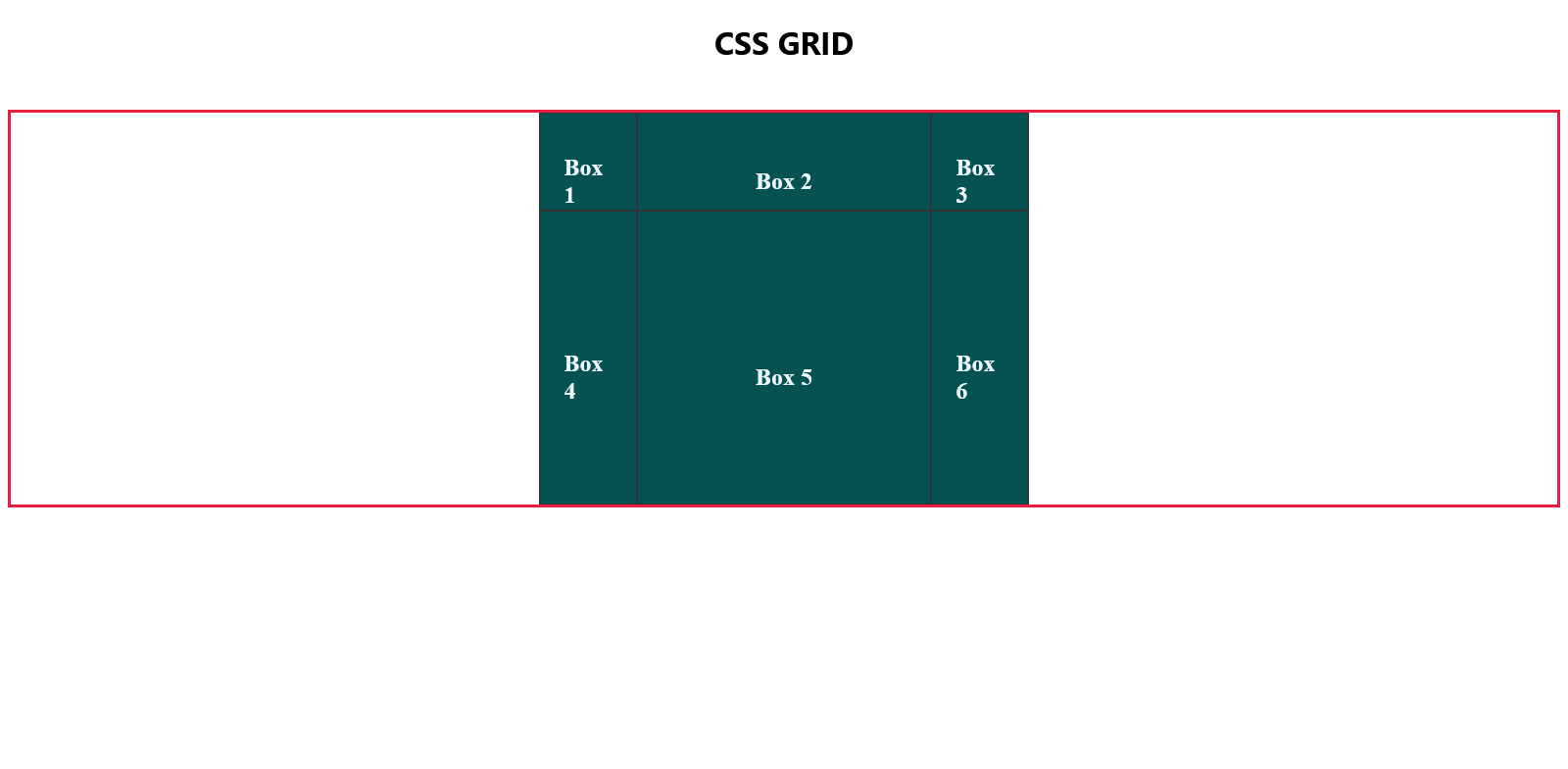
Let's promptly establish a template for the grid container another_container.
.another_container {
    margin-top: 3rem;
    border: 3px solid #e72041;
    display: grid;
    grid-template-columns: 100px 300px 100px;
    grid-template-rows: 100px 300px;
    place-content: center;
}
With this configuration, we define the grid with three columns, where the first and last are of equal width, and the middle one spans 300px. Additionally, we specify two rows, with the first measuring 100px in height and the second measuring 300px in height. The container is centered on the page.
Remember to remove the 50px height we had set on each box in another_container.
.another_container .boxes {
    background: #065252;
    color: aliceblue;
    padding: 1rem;
}
These adjustments result in the following appearance of the grid:
Grid Template Areas
Let's now delve into a new concept called grid-template-areas.
The key grid-template-areas takes values enclosed in quotes. The number of sets of quotes represents the number of rows in the targeted container.
For instance, consider this hypothetical grid container with a class of some-container having five rows; hence, five sets of quotation marks are passed as values for grid-template-areas.
.some-container {
    display: grid;
    grid-template-columns: 50px 50px 50px;
    grid-template-rows: 50px 50px 50px 50px 50px;
    grid-template-areas:
        ""
        ""
        ""
        ""
        "";
}
In another hypothetical example, a grid container with a class of some-other-random-container has three rows, hence three sets of quotation marks in grid-template-areas values.
.some-other-random-container {
    display: grid;
    grid-template-columns: 50px 50px 50px 50px 50px;
    grid-template-rows: 50px 50px 50px;
    grid-template-areas:
        ""
        ""
        "";
}
For our another_container grid container, featuring two rows (one with a height of 100px and another with a height of 300px), grid-template-areas will have two sets of quotation marks in the value section.
Inside each set, we pass values representing the names of columns within that row. The values describe what we intend each column in the row to represent. For example, we might want the first column to be a menu item. So we could pass "menu-item" as the first value.
Values describing a row are written in snake_case, kebab-case, camelCase or PascalCase. For a three-column row, you need to pass three values each in either of these formats and separated from each other by a space as in the below code snippet.
.another_container {
    margin-top: 3rem;
    border: 3px solid #e72041;
    display: grid;
    grid-template-columns: 100px 300px 100px;
    grid-template-rows: 100px 300px;
    place-content: center;
    grid-template-areas:
        "menu-left header-central menu-right"
        "body-left content-center body-right";
}
To assign grid items to specific sections, instead of specifying row-start, row-end, column-start, and column-end as values, we now use the grid-area property.
By default, the grid items are assigned to the template areas of the container in the order they appear in the HTML document. The default assignment is as outlined in the previous illustration.
Nonetheless, we can individually target each grid item and associate them with specific grid template areas.
Examine the following code, targeting Box 6, which has a class of item-6 and Box 3, which has a class of item-3.
.item-6 {
    grid-area: menu-left;
}

.item-3 {
    grid-area: content-center;
}
Now, we have designated Box 6 to the template area we labelled menu-left (originally occupied by Box 1 in the previous illustration), and Box 3 to the template area we named content-center (initially occupied by Box 5).
This adjustment results in the page rendering as follows:
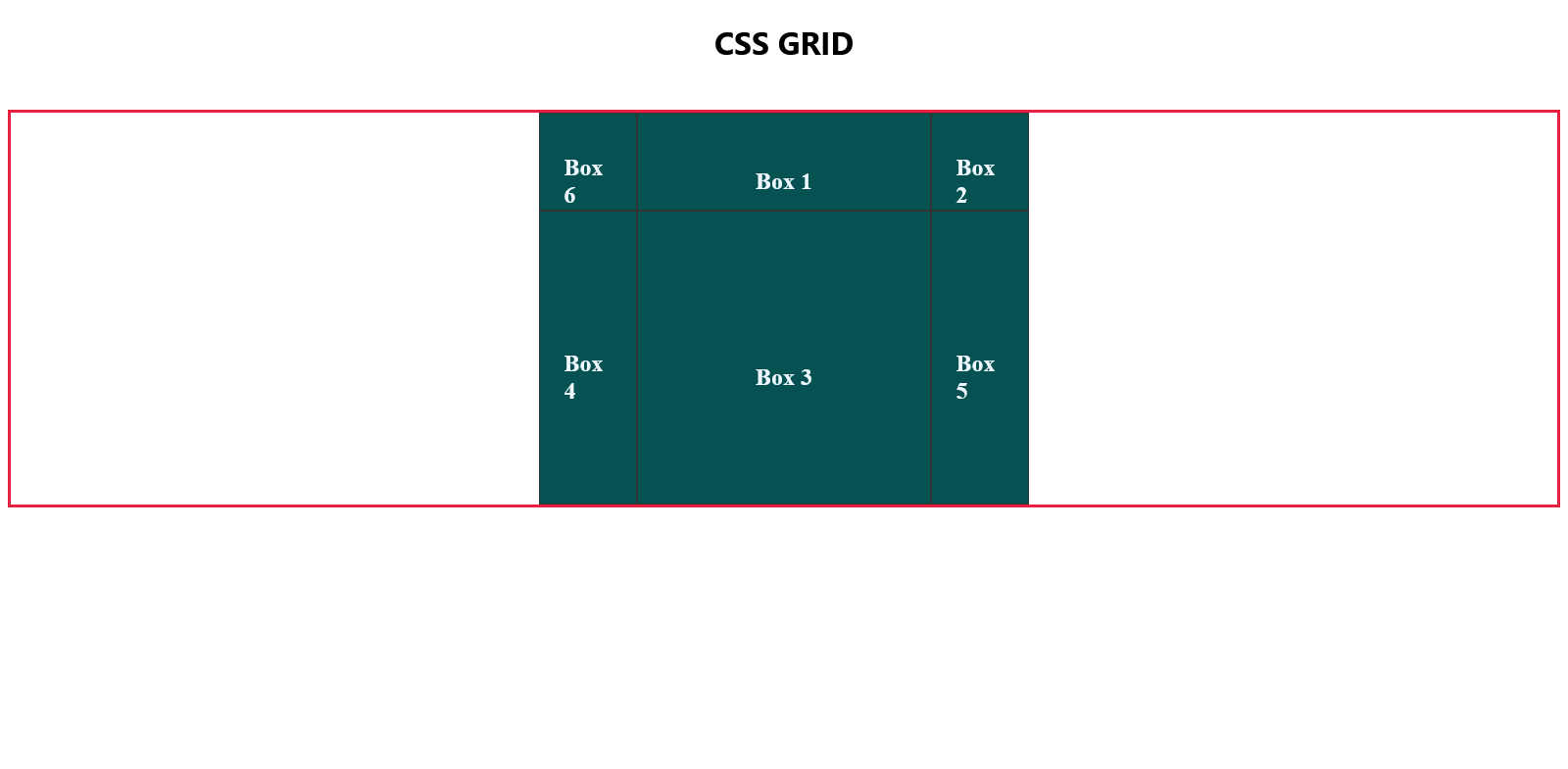
Unallocated boxes will automatically fill empty grid spaces, prioritizing the row axis and then the column axis.
Let's proceed to designate specific grid areas for all the boxes.
.item-1 {
    grid-area: body-right;
}

.item-2 {
    grid-area: menu-right;
}

.item-3 {
    grid-area: content-center;
}

.item-4 {
    grid-area: header-central;
}

.item-5 {
    grid-area: body-left;
}

.item-6 {
    grid-area: menu-left;
}
All the grid items have now been moved around the grid container from their defaults:

NOTE: If anything, this teaches us to differentiate the grid cells from the grid items. The grid cells are formed when templating is done while the items only conform to the grid areas they have been instructed to occupy in the container. Grid lines are invisible on the page but they form the basis of a Grid outline.
Wrapping Up the Grid
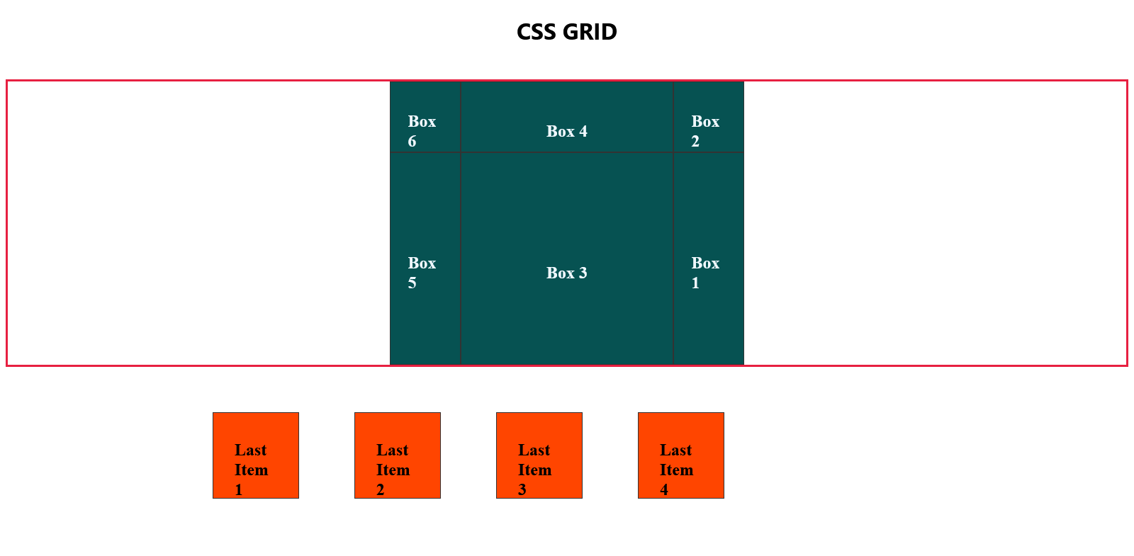
Let's create a new container below another-container:
<div class="last-container">
    <div class="boxes last-item1">
        <h2>Last Item 1</h2>
    </div>
    <div class="boxes last-item2">
        <h2>Last Item 2</h2>
    </div>
    <div class="boxes last-item3">
        <h2>Last Item 3</h2>
    </div>
    <div class="boxes last-item4">
        <h2>Last Item 4</h2>
    </div>
</div>
Let us start by overriding the background colour and size inherited from the boxes class:
.last-container .boxes {
    background: orangered;
    height: 120px;
    width: 120px;
}
Subsequently, let us establish a template for the grid container:
.last-container {
    margin-top: 4rem;
    display: grid;
    grid-template-rows: repeat(4, 200px);
    grid-template-columns: repeat(5, 200px);
    place-content: center;
}
If you commented out the first container we created, this is how the page should now appear:
Again, moving forward, our sole focus will be on this newly created container. Feel free to comment out another_container for now.
The arrangement and structure of this grid, along with the positioning of items, offer us a perfect chance to segue into the concepts of justifying and aligning content.
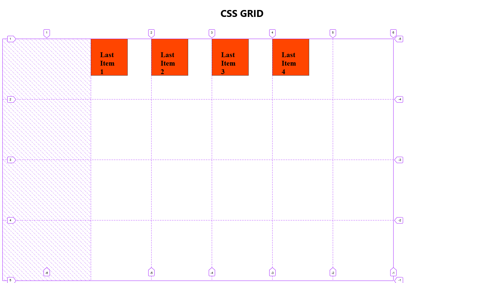
Justify Items
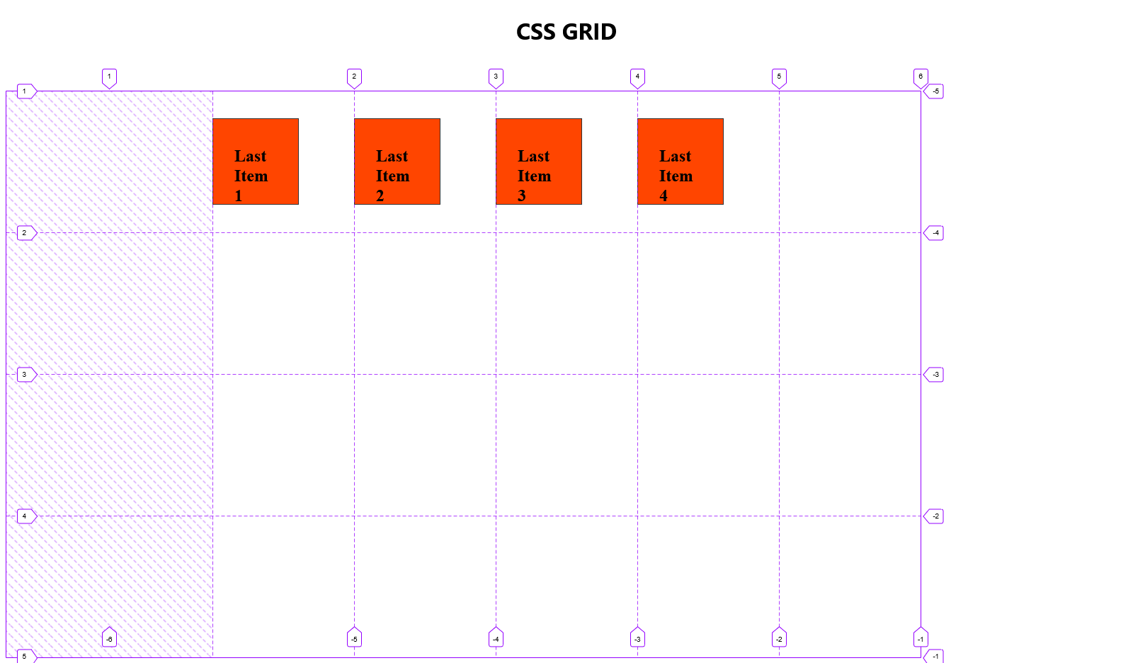
CSS Grid has a property called justify-items that horizontally aligns grid items within the cells. This property is applied to the container, not individual grid elements.
By default, the value of this property is set to justify-items: stretch, as illustrated in the screenshot above, depicting the default behaviour.
Now, let's experiment with relocating the items within their cells using different justify-items values:
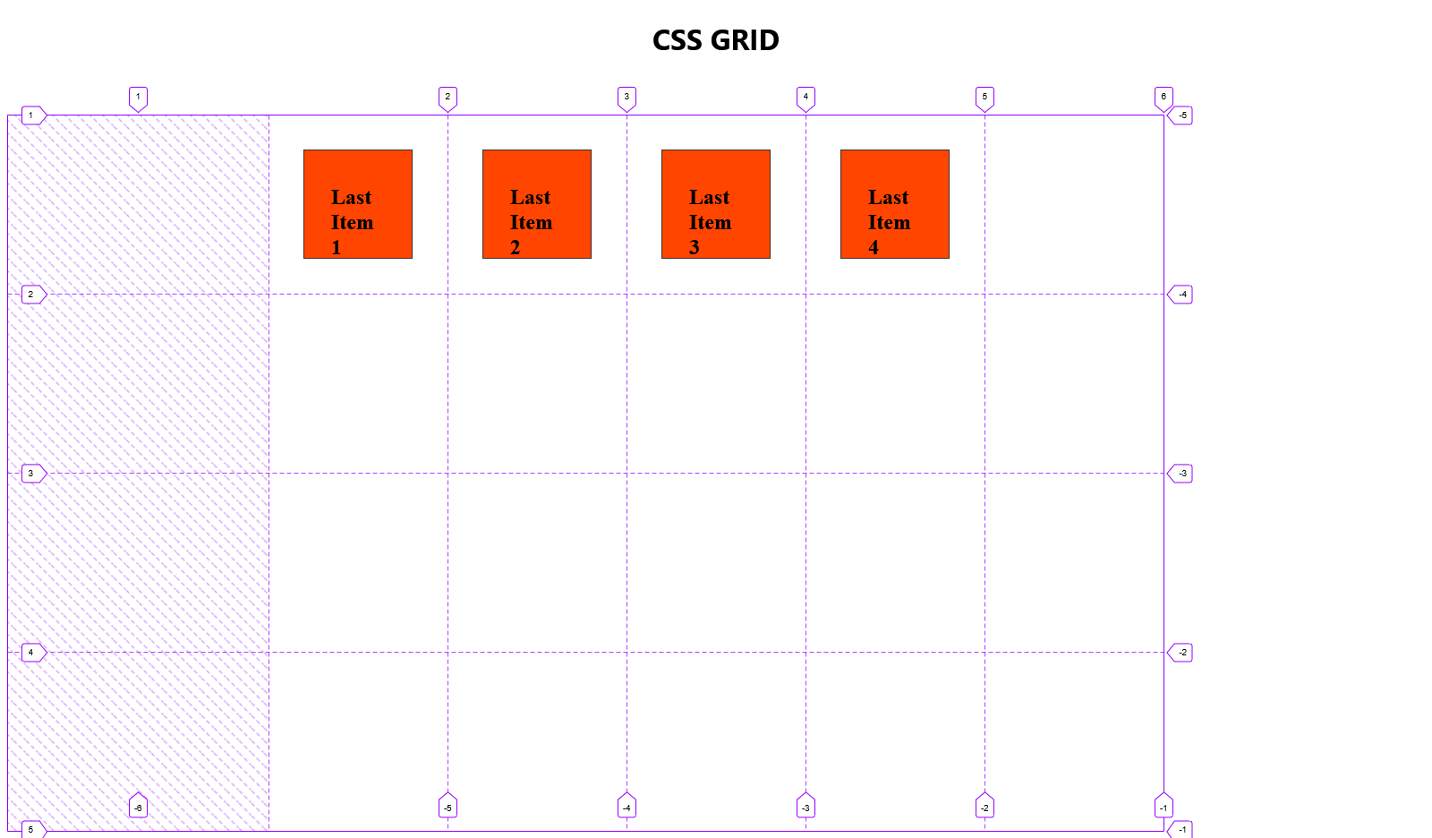
justify-items: end
.last-container {
    margin-top: 4rem;
    display: grid;
    grid-template-rows: repeat(4, 200px);
    grid-template-columns: repeat(5, 200px);
    place-content: center;
    justify-items: end;
}
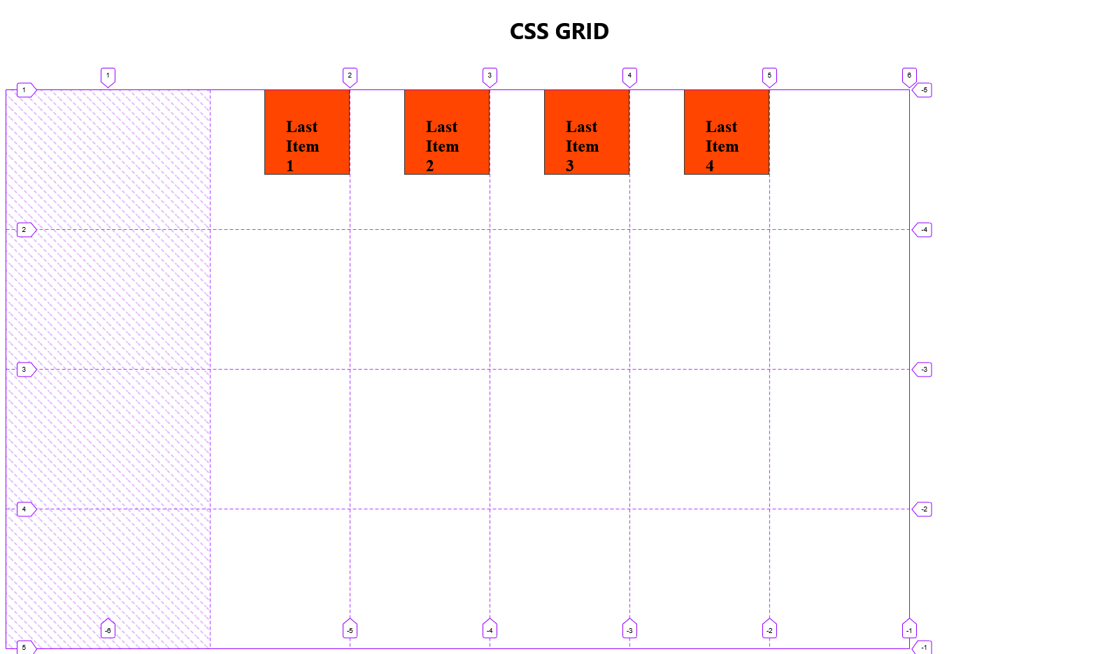
justify-items: center
.last-container {
    margin-top: 4rem;
    display: grid;
    grid-template-rows: repeat(4, 200px);
    grid-template-columns: repeat(5, 200px);
    place-content: center;
    justify-items: center;
}
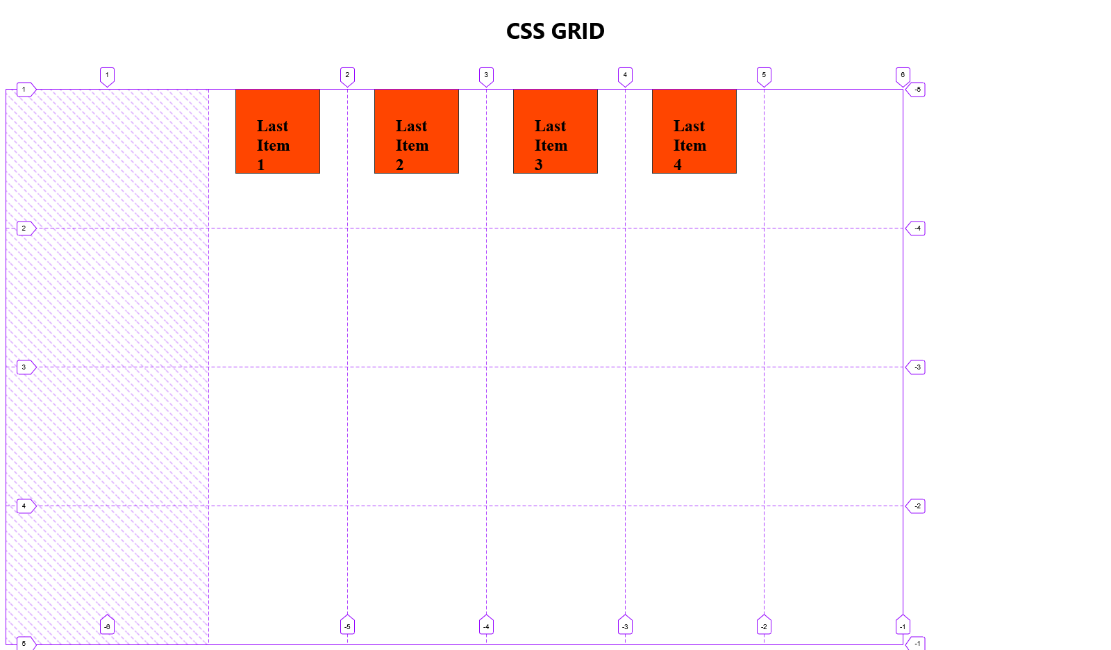
Align Items
Just like in Flexbox, align-items is used to position items vertically (along the column axis).
Let us move the grid items around in the container:
align-items: start
Aligns the element to the start of the row axis in the container it's inside of.
.last-container {
    margin-top: 4rem;
    display: grid;
    grid-template-rows: repeat(4, 200px);
    grid-template-columns: repeat(5, 200px);
    place-content: center;
    align-items: start;
}

align-items: start
Aligns the element to the midpoint of the row axis in the container it's inside of.
.last-container {
    margin-top: 4rem;
    display: grid;
    grid-template-rows: repeat(4, 200px);
    grid-template-columns: repeat(5, 200px);
    place-content: center;
    align-items: center;
}
align-items: center && justify-items: center
Centers the items. This is another way to center a div and is the Grid equivalent of justify-content: center and align-items: center in Flexbox.
.last-container {
    margin-top: 4rem;
    display: grid;
    grid-template-rows: repeat(4, 200px);
    grid-template-columns: repeat(5, 200px);
    place-content: center;
    justify-items: center;
    align-items: center;
}
justify-self and align-self
Unlike the previous properties we have covered in this section, these properties are called on the grid items themselves and are used to override the values set on the grid container for all the children.
Our grid items currently appear as in the previous illustration.
What if we want to make the following changes:
Item 1 to justify start and align end.
Item 2 to align start and end justify center.
Item 4 to align center and justify start.
Our end product should look like this:
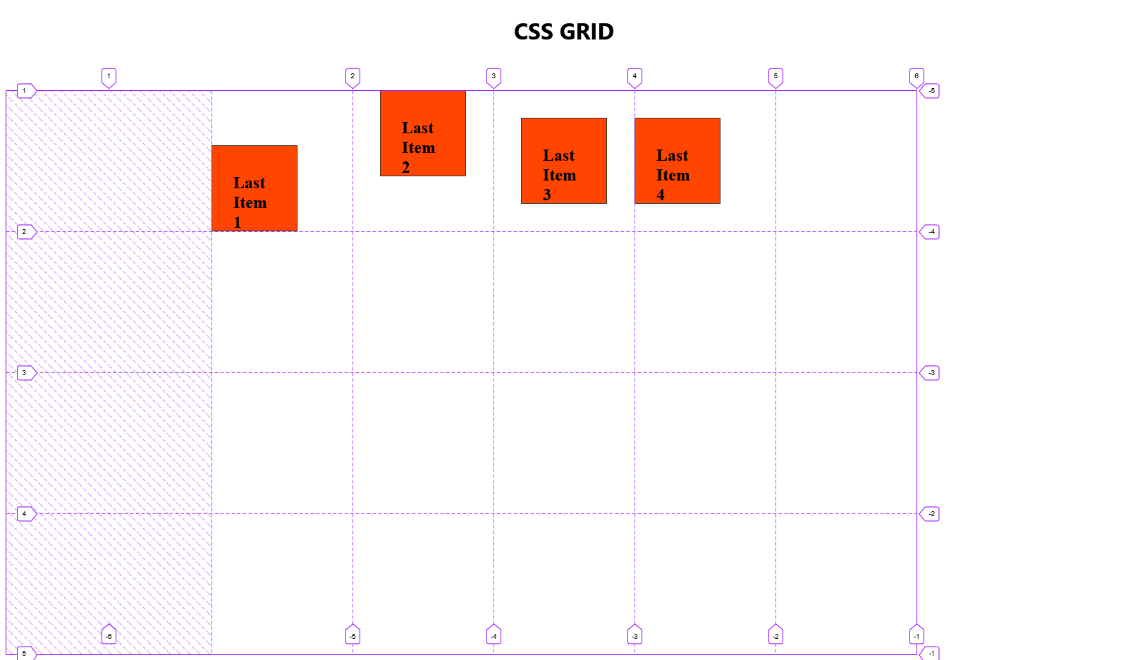
To accomplish this, we can utilize the align-self and justify-self properties on the grid items.
/* Adjusting Last Item 1 */
.last-item1 {
    justify-self: start;
    align-self: end;
}

/* Modifying Last Item 2 */
.last-item2 {
    justify-self: center;
    align-self: start;
}

/* Refining Last Item 4 */
.last-item4 {
    justify-self: start;
    align-self: center;
}
Conclusion
In conclusion, delving into the intricacies of CSS Grid layout offers a powerful toolset for creating responsive and visually appealing designs. Through the exploration of grid properties, template areas, and item placement, we've gained insights into shaping complex layouts with precision.
This level of control ensures that designs not only look visually appealing but also adapt seamlessly across different screen sizes and devices.
As we wrap up our exploration of CSS Grid, remember that the principles discussed here serve as a foundation for creating dynamic, responsive, and aesthetically pleasing web layouts. Continued practice and experimentation will deepen your proficiency in harnessing the full potential of CSS Grid, enabling you to design sophisticated and adaptive user interfaces.
With these newfound skills, you are well-equipped to elevate your web development projects to the next level. Happy coding!


